
How to Build a Churn Risk Report: The Methodology, the Joins, and the Dimensions
Your CRM can tell you exactly which accounts churned last quarter, but it cannot tell you which ones are about to.
Here is what closing that gap looks like. A well-known B2B software team ran six months of support conversations against their renewal data: roughly 800 conversations, split about 55/45 between renewals and churns. Two rounds of analysis later we had a ranked list of churn drivers and an account-level watchlist covering just over 60 accounts and eight figures of ARR exposure, each account scored, segmented, and assigned a next action.
We used Dimension Labs platform to run the full analysis in minutes, and nobody wrote a SQL query by hand.
The speed is important but also that every step is reproducible, and the aim of this guide is to explain the methodology behind building an impactful analysis. So what actually goes into a churn risk report, and which parts of it can you skip?
Key takeaway: A churn risk report is two analyses stacked: an aggregate driver ranking that tells you why accounts leave, and an account-level risk score that tells you who is leaving next. Both come down to joining conversation data to revenue data, which means the real work is not the SQL. It is having conversations that are already structured enough to join.
What a churn risk report has to answer
Three questions, in order.
What drives churn? Across your whole book, which signals separate accounts that renew from accounts that leave. This is the aggregate driver analysis.
Which accounts are at risk right now? Not a probability score from a black-box model. A named list, ranked, with the evidence attached.
What do we do about each one? Different risk patterns need different plays. An account sitting on an unresolved P1 needs a save motion. An account running a parallel vendor evaluation needs a competitive motion.
Most churn reporting stops at the first question, produces a slide titled “Top Churn Reasons,” and gets forgotten. The value is in questions two and three, and you cannot get there without the join.
The data foundation: two tables, one key
The entire analysis runs on two tables.
Account metadata, sourced from CRM and billing. One row per account: account ID, company name, ARR, tier, region, CSM, primary product, days since onboarding, renewal date, renewal outcome.
Conversation Dimensions, extracted per record from support chats and tickets. One row per conversation, carrying roughly three dozen structured fields: churn signal, resolution status, trust and confidence signal, adoption signal, billing signal, support interaction quality, issue category, value realization driver, competitor mention, escalation flag, expansion signal, sentiment verbatim, and more.
They join on a shared partition key:
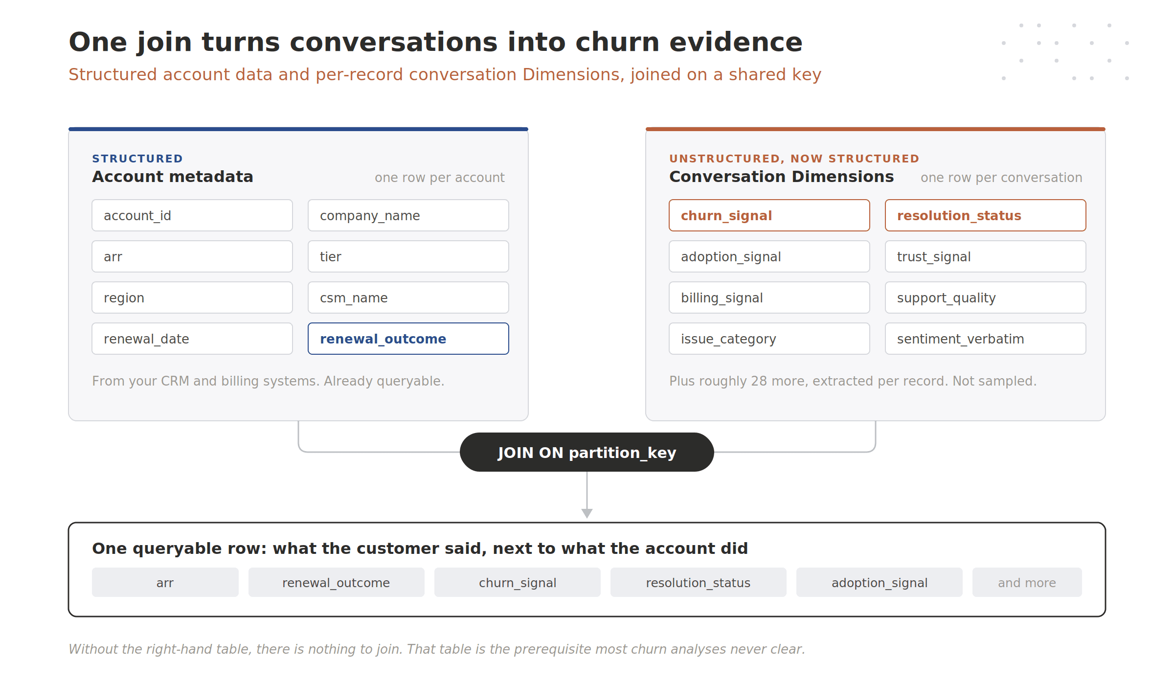
That second table is the whole ballgame. It is not a table of raw chat text with a sentiment score bolted on. Every conversation already carries dozens of queryable fields, extracted per record rather than sampled or summarized. Nothing needed to be tagged or coded before analysis could start. This is what Dimension Labs calls the Meaning Layer, and it is why the analysis becomes a SQL problem rather than a data engineering project.
If your conversations live as blobs of text inside a support platform, you do not have this table. You have a prerequisite.
Phase 1: rank the drivers
The prompt was seven words: give me an executive level report on what’s driving churn.
Seven steps followed, in order:
Inventory the schema. List the tables, then query the column metadata to pull every field name and type. You cannot rank drivers you did not know you had, and there were three dozen on the conversation table alone.
Scope the baseline. Three quick counts: renewal outcomes, churn signal distribution, and the date range. This establishes the roughly 45% baseline churn rate that every driver gets measured against.
Compute churn rate per dimension. One pass per candidate driver field, individually.
Rank across dimensions. Collapse the results into a single leaderboard.
Pull verbatims. Attach real customer language to the statistical findings.
Visualize. Render the ranked drivers as charts.
Synthesize. Group drivers into themes and write the recommendations.
Step 3 is the workhorse. In plain terms, each query joins the two tables on the partition key, groups by one Dimension’s values, and computes churn rate as churned divided by total for each value. Something like count churned and renewed per adoption signal value, then divide.
Two details in there matter more than they look.
Set a minimum volume floor. Without one, a Dimension value that appears in three conversations and happens to churn all three tops your leaderboard at 100% and sends your CS team chasing noise. Ten records is a reasonable floor for single-dimension passes. Twenty is better once you start comparing across dimensions, because the weakest row sets the credibility of the whole table. Whatever you pick, say what it was in the methodology section.
Filter the placeholder values. Most Dimensions carry an explicit “nothing detected here” value, and it will show up in your ranking sitting on hundreds of rows with a middling churn rate. It is a placeholder, not a driver. Strip it before you present, or you will be explaining to a VP why “none detected” is the fourth-largest cause of churn.
Then collapse the individual passes into one ranking. Conceptually you are stacking each dimension’s results into a single result set with a dimension-name column, then sorting the whole thing by churn rate: union the per-dimension summaries together, keep rows above the volume floor, order by churn rate descending. One query, one leaderboard, regardless of which field each signal came from.
The top of that list:
Dimension | Driver value | Churn rate | Volume |
|---|---|---|---|
Adoption signal | Low adoption concern | ~100% | ~20 |
Issue category | Onboarding delay | ~100% | ~20 |
Adoption signal | Stalled adoption | ~93% | ~30 |
Support quality | Lost context on handoff | ~84% | ~45 |
Support quality | Slow response | ~84% | ~50 |
Resolution status | Resolved but recurring | ~82% | ~35 |
Trust signal | Trust eroding, unmet promise | ~80% | ~120 |
Resolution status | Not resolved | ~74% | ~250 |
Read the last two rows against the first three. The 100% drivers are small and sharp. The trust and resolution drivers are only in the seventies but sit on more than ten times the volume. Ranking by rate alone tells you which signals are lethal. You need volume beside it to know which ones are worth a program. Both columns belong in the report.
The substantive finding was that three of the top drivers were adoption failures rather than product complaints, which moved the intervention budget from engineering toward onboarding.
Phase 2: score accounts into a watchlist
Phase 1 closed with a recommendation: build a watchlist for any account showing an explicit churn threat, a vendor evaluation, or an unresolved issue. The follow-up prompt was that sentence, typed back verbatim.
Start by flagging conversations that carry a hard risk signal. In plain terms: select every conversation where the churn signal is an explicit threat or a vendor evaluation, or where resolution status is unresolved. That returned a few hundred flagged conversations across just over 60 distinct accounts, weighted heavily toward unresolved issues.
Then weight them. Not every signal deserves the same points:
Signal | Dimension | Points |
|---|---|---|
Explicit churn threat | Churn signal | 5 |
Vendor evaluation mentioned | Churn signal | 4 |
Issue not resolved | Resolution status | 3 |
Trust erosion (unmet promise, repeated failure) | Trust signal | 2 |
Adoption stall (low adoption, stalled adoption) | Adoption signal | 2 |
Commercial pressure (overage dispute, price increase, contract reduction) | Billing signal | 1 |
Support quality (slow response, lost context on handoff) | Support quality | 1 |
The scoring query adds those cases up per conversation, then rolls up to the account: sum the risk points per account, count the flagged conversations, carry the max ARR and the account attributes through, and order by score descending.
Two practical notes from doing this on real data.
ARR almost always lands as a text field in CRM exports. Cast it to a number explicitly, or your sum silently returns nothing useful. And because you are grouping to the account level, use an any-value aggregate for descriptive fields like CSM and tier rather than trying to group by all of them.
Score and ARR will disagree, which is why the watchlist shows both. In this analysis the highest-scoring account was mid-size, while a much larger account landed further down the list. A CRO needs to see the ranking on both axes to decide where the executive sponsor goes.
Two moves finish the report. First, segment accounts by which combination of the three core triggers they hit:
Watchlist segment | Share of accounts | Share of at-risk ARR |
|---|---|---|
All three triggers | ~40% | ~44% |
Unresolved only | ~33% | ~30% |
Vendor evaluation + unresolved | ~14% | ~16% |
Explicit threat + unresolved | ~12% | ~10% |
Single trigger, no unresolved issue | ~1% | ~1% |
The concentration is the finding. Accounts hitting all three triggers were the largest segment by both count and ARR, which means the watchlist is not a long tail of minor grumbles. It is a compact set of accounts failing in several ways at once.
Then pull the most recent verbatims from accounts with two or more triggers, ordered by recency. A risk score gets an executive’s attention. A direct quote from the account gets a response.
One caveat worth putting in your own methodology section. Renewal outcome lives on the account, while the analysis runs at conversation grain, so these churn rates are conversation-weighted. Accounts with more conversations carry more weight. That is defensible for driver ranking, since the question is which signals accompany churn. Say it out loud rather than letting someone find it in the appendix.
What the same report costs without a Meaning Layer
The queries above are maybe two hours of work for a competent analyst. Everything upstream of them is where teams lose quarters.
Without a Meaning Layer | With Dimension Labs | |
|---|---|---|
Getting conversation data queryable | Build ingestion per channel, normalize schemas, land it in the warehouse | Already landed, already normalized |
Creating the risk signals | Define a taxonomy, then hand-tag a sample or build and maintain an LLM labeling pipeline | Dozens of Dimensions extracted per record on ingest |
Coverage | Manual tagging realistically reaches 1–5% of records, so findings are directional at best | 100% of records, not sampled, not summarized |
Consistency across runs | Prompts drift, outputs shift, last quarter’s numbers stop matching this quarter’s | Versioned Dimensions with an audit trail |
Joining language to revenue | Blocked until the labeling problem is solved | One join on a shared key |
Re-running next month | Repeat most of the above | Re-run the saved analysis against new data |
Time to first report | 3–6 months, minimum | Same day |
The uncomfortable math behind that first column: roughly 80% to 90% of enterprise data is unstructured, and only 18% of organizations in a 2019 Deloitte survey said they were able to take advantage of it. Deloitte also found that executives who rate unstructured data among their most valuable sources of insight are 24% more likely to have exceeded their business goals. Churn is the cleanest example of why. The outcome lives in the warehouse. The reason lives in a transcript.
Can your current stack run this analysis today?
Capability | Support platform + BI | Dimension Labs |
|---|---|---|
Query a support conversation like a table column | No | Yes |
Compute churn rate per conversation signal | No | Yes |
Join conversation signals to ARR and renewal outcome | No | Yes |
Score individual accounts on conversation evidence | No | Yes |
Trace a risk score back to the exact conversations behind it | No | Yes |
Re-run the identical methodology next month | No | Yes |
If your answers stop at the first row, the churn analysis you are running is a report on what already happened.
Where the agent does the work
Everything above is the methodology. An analyst did not write those queries.
The Dimension Labs agent worked the problem the way a good analyst would. It read its available skills for schema inspection, root-cause driver analysis, and charting. It inventoried the schema, scoped the baseline, then generated and ran every query behind this post. It set the volume thresholds. It caught the ARR field arriving as text. It pulled the verbatims, loaded the chart design system, rendered branded visuals, grouped the ranked drivers into themes, and wrote the executive summary with recommended actions.
Then the methodology was saved as a Skill, which means next month is not a project. It is a re-run.
The output reads like this:
Eight figures of ARR are on the churn watchlist, spread across just over 60 accounts. Primary driver: adoption failure, not product dissatisfaction. Low adoption concern and onboarding delay both correlate with near-total churn above the volume floor; stalled adoption sits at 93%. Highest-exposure segment: the accounts hitting all three core triggers, roughly 44% of at-risk ARR. Recommended action: save-now motion on the all-trigger segment, competitive motion on accounts with active vendor evaluations, stabilize motion on unresolved-only accounts.
Three motions, not one list. Each with named accounts and a next step.
So which report is your team producing right now? The one that explains last quarter’s churn, or the one that names the accounts you can still keep?
Your CRM knows who churned. Your conversations know why, and they knew weeks before the CRM did.
Frequently Asked Questions
What is a churn risk report?
A churn risk report combines two analyses: an aggregate ranking of the signals that separate churned accounts from renewed ones, and an account-level risk score that names which specific accounts are at risk right now. The second half is what makes it actionable, and it requires joining conversation data to revenue data at the account level.
How is a churn risk report different from a churn prediction model?
A prediction model outputs a probability, like “this account has a 73% chance of churning,” without explaining the mechanism. A churn risk report is built from named signals extracted from actual customer conversations, so every score traces back to the specific tickets, chats, or calls that produced it. Your CS team can act on the second one because they can see the reason.
What data do you need to build a churn risk report?
Two things: account-level structured data with renewal outcomes and ARR, and conversation-level data where each record already carries structured fields such as churn signal, resolution status, adoption signal, and trust signals. The second requirement is where most teams stall, because raw transcripts cannot be joined to a revenue table until something has extracted queryable fields from them per record.
How do you weight a churn risk score without overfitting?
Start with signal severity rather than statistical fit. An explicit churn threat is worth more than a slow support response because of what it means, not because a regression said so, and a simple additive score stays explainable to the CSM who has to act on it. Once you have a few quarters of outcomes against the same versioned Dimensions, check the weights against actual renewals and adjust.
How often should you re-run a churn risk report?
Monthly, which is exactly why the methodology matters more than the one-off analysis. If the extraction logic is versioned and the analysis is saved as a repeatable plan, each run is comparable to the last and you can watch risk scores move. If it depends on prompts or hand-tagging that change between runs, you are producing a new report every month rather than tracking the same one.
Sources:
MIT Sloan Management, “Tapping the power of unstructured data.” https://mitsloan.mit.edu/ideas-made-to-matter/tapping-power-unstructured-data
Deloitte, “Analytics and AI-driven enterprises thrive in the Age of With” (2019). https://www.deloitte.com/us/en/insights/topics/analytics/insight-driven-organization.html